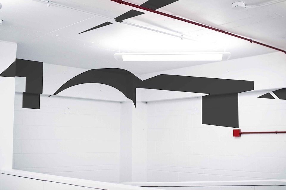
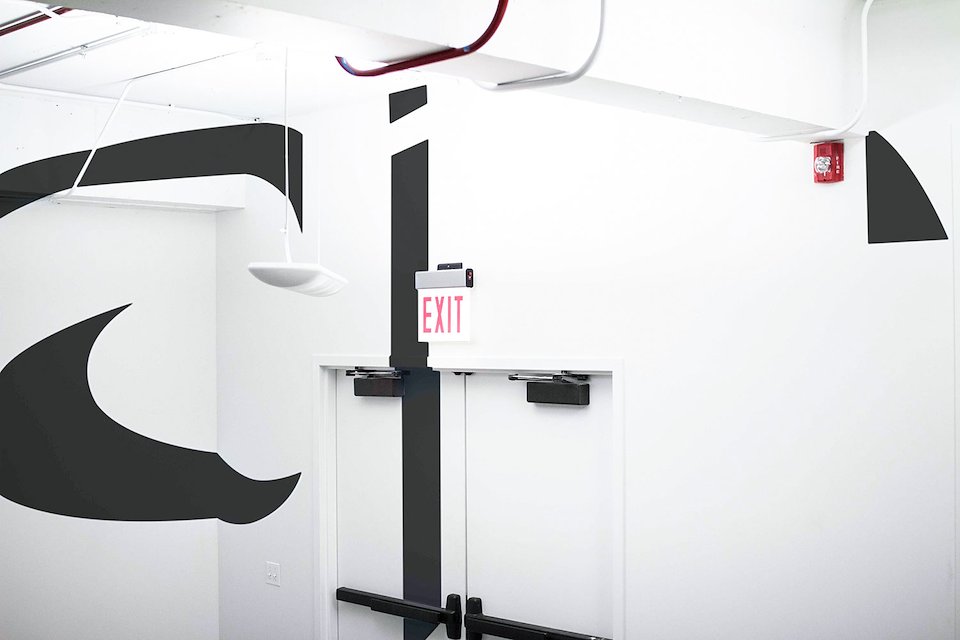
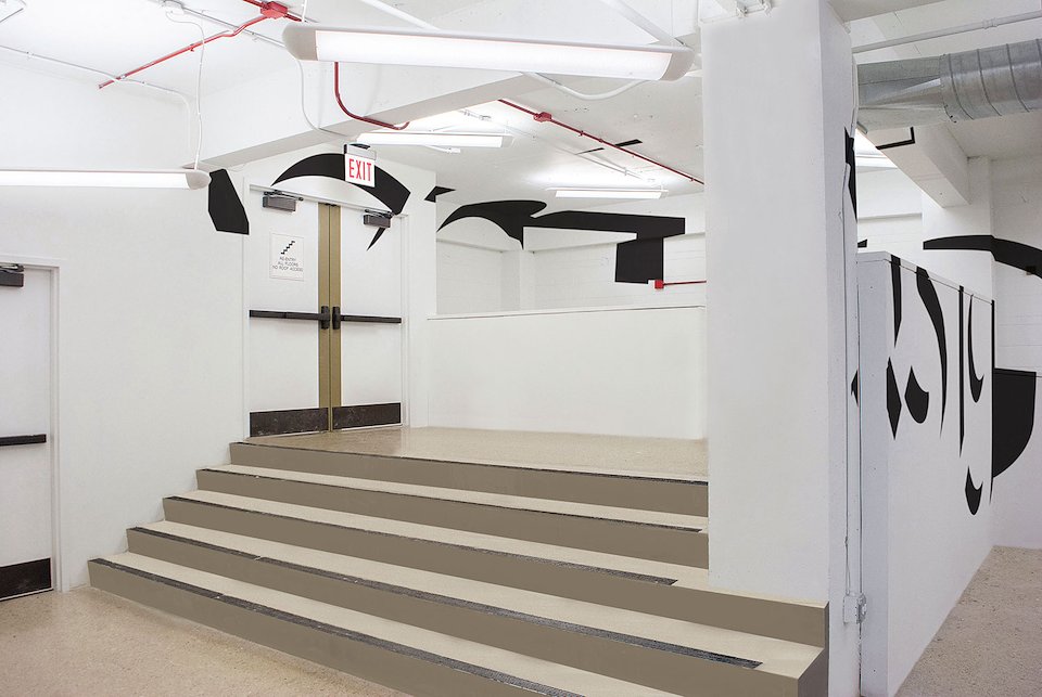
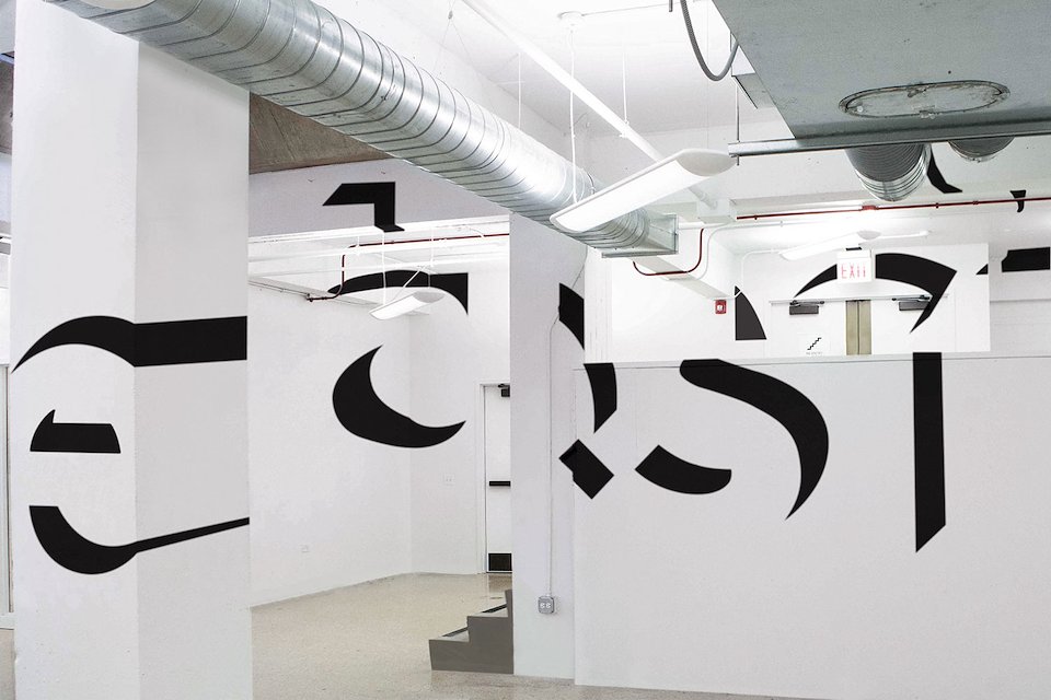
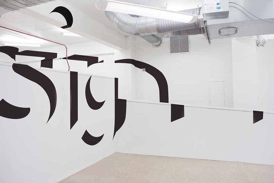
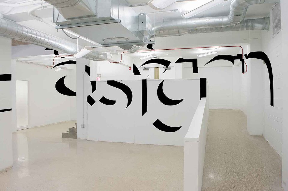
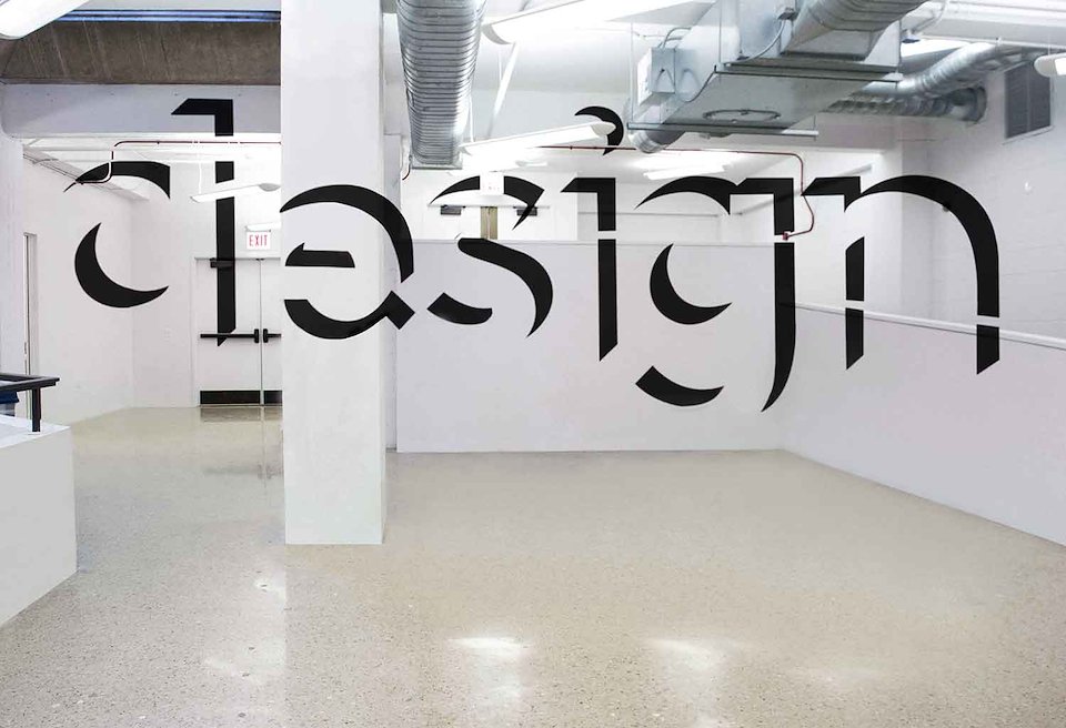
This is a proposed installation for the UIC School of Design common area. This mock-up demonstrates an approach to “projection”. Using an anamorphosis technique where the projection appears normal only when entering through the doorway– but is revealed to be distorted as you walk past it.
The placement of the projector was determined by an average viewer’s line of sight. The letterforms are black, so that it contrasts with the stark white paint of the building. The example shown uses the school’s official typeface LL Brown to keep with the aesthetic of the school.